
Problems
On web, panels were added very quickly and were not carefully designed from an navigation infrastructure perspective
Performance is bad, especially for first load. And especially on mobile
Initial load time has a huge effect on the perceived quality of the product, and will cause users to be unhappy and leave, rather than reading and participating in their community
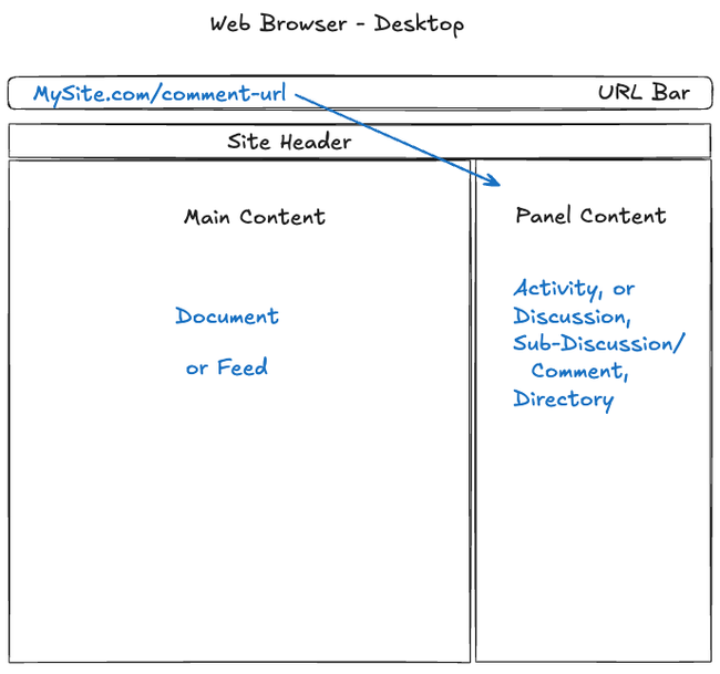
Not every panel has a URL, so you can't link to some things
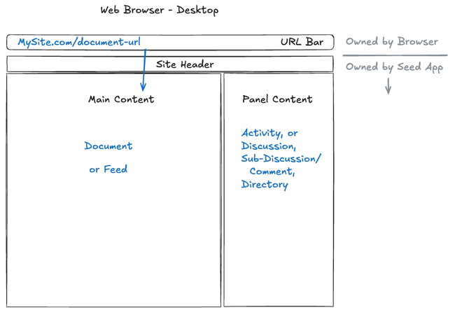
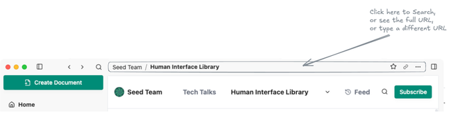
It is not clear which URL will be copied from the URL bar: the URL of the panel, or the URL of the document
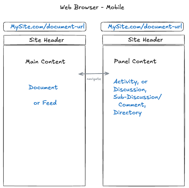
An overview of our existing UI:
On mobile this is not strictly a UX problem, but we have performance problems, especially when loading a comment because the whole document is loaded behind it.
Outcome
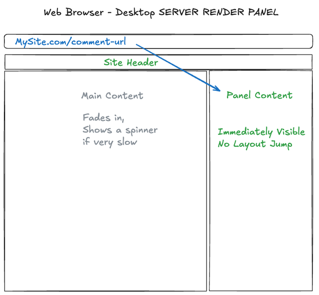
Every panel should have a copy-pasteable web URL
On first load, the addressed part should load immediately: sometimes main content, sometimes the panel
The other part can fade in (loaded with async requests- not server rendered)
There will be a visual highlight around either the main content or the panel, which matches the URL in the URL bar
This has not been designed yet, it should be subtle but noticeable when it changes
Performance will be improved when first loading on web
Performance will be improved on mobile- especially for commenting
Panel code and behavior will be consistent with desktop
Solution
The initial solution will focus on the document page experience, but the infrastructure can eventually be applied to all pages
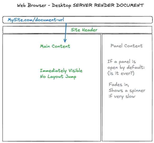
Server Rendering
We will be more deliberate about when to use server rendering. This will help draw the user's attention to the content that is being addressed, and the other panel will come in a bit later- it will not be server rendered and will use an async request to load.
Also, we should be careful with CSS to make sure the content does not jump around during load.
On mobile this will have a noticeable effect on performance because we will not need to load the section of the page that is not even visible.
Visually Show the focused panel
The user should see which panel is currently focused, and the focused panel should match the URL bar
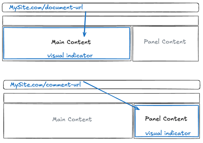
When the user clicks or interacts with one section of the page, the visual highlight should move to that section, and the URL should change.
When the user clicks something to open or switch the panel, the panel will be focused
Selection UI
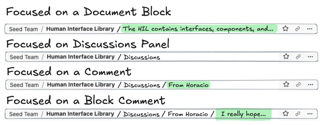
The green highlights indicate "selection" in the app. The selection should only exist in the focused panel. If you click outside the focused panel, the green selection inside will go away
Always Push Forward
Whenever the user clicks or interacts in a way that changes the navigation state, this will logically "push" forward in the navigation history. So if the user accidentally changes their selection by clicking, they can always click back to return to the previous navigation state.
We may reconsider this if it gets annoying to click back too many times, but I think most users will be comfortable to continue clicking until they get back to the correct location.
This should be consistent on web and desktop.
Desktop Consistency
The title bar breadcrumbs in the desktop app should show the full path, including the panel, and selected content in the fragment URL.
The copy link button will always copy the full focused URL, like it would in the web browser when you copy the full text of the current URL bar.
Panels in the Main View
This project enables panels to open in the main view, but it does not need to be completed immediately. It depends on the desired UX.
Panels will be converted to full routes. The document route (and other routes which support the accessory sidebar) will have a panel field which allows a full route. Such as a directory route.
For the sake of prototyping this, we can have a button that pops a panel out into the main section and fully opens the route. But this button may be disabled before deploying.
No Goes
The desktop app will be updated to look and feel more like a web browser.
The launcher can be opened by clicking in the empty space of the title bar, and the text input will happen in the title bar location. This is an idea, and is not included in this project:
Do you like what you are reading? Subscribe to receive updates.
Unsubscribe anytime